Revolt Customer Portal
Making battery recycling easier to understand, track, and act on.
A customer-facing portal for Northvolt Revolt, designed to help recycling customers follow orders, understand material progress, and act on key next steps — built and MVP-tested with B2B customers.
Battery recycling is simple to say — and brutally complex to do.
Before a single screen could be designed, the service had to be understood. The recycling journey involved scattered emails, unclear ownership, compliance steps, logistics details, and status updates that customers could not easily follow.
"We understood the process internally. Our customers never saw a clear version of it."
— Stakeholder interview, synthesis phaseThe moment the service became understandable.
Through stakeholder interviews and need mapping, I separated what customers needed to know from what the business needed to capture. This became the foundation for the portal's information architecture and task flow.
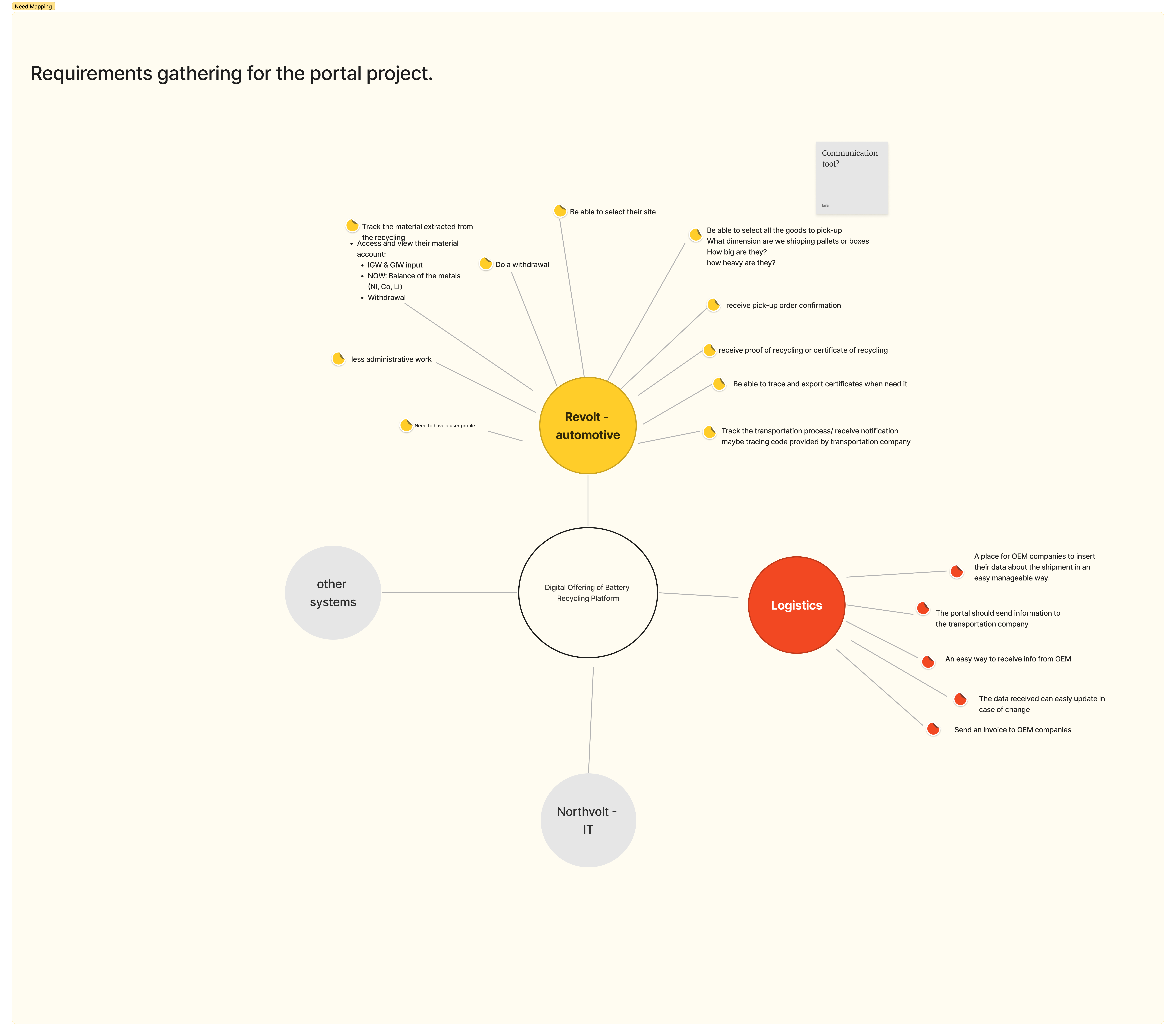
Customers managing shipments
Booking pick-ups and tracking requests, requirements and status from one place.
Internal support
Onboarding accounts and setting customers up behind the scenes.
Sustainability & reporting
Traceability and documents for compliance and impact reporting.
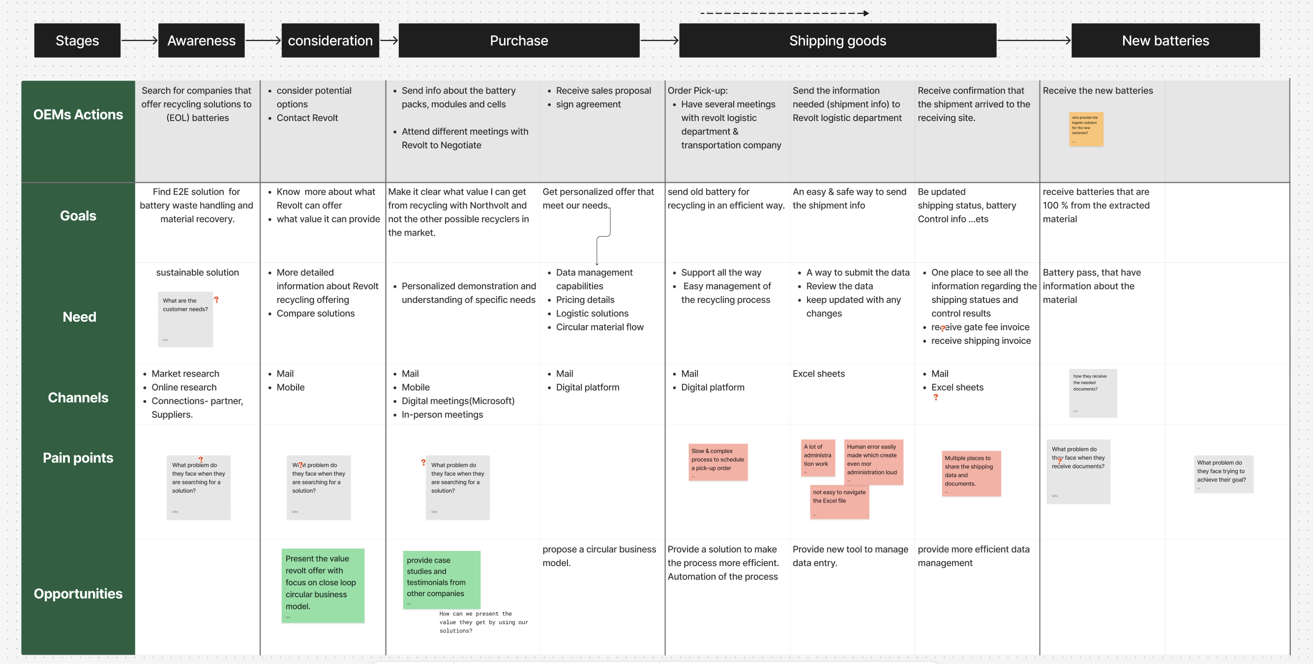
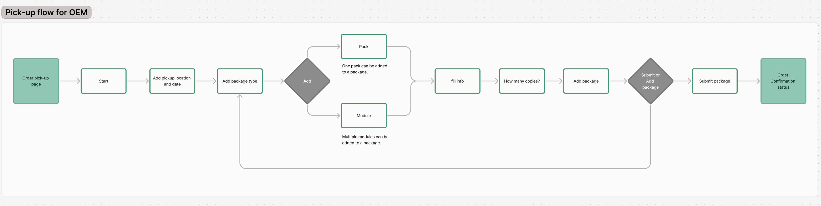
A sprawling service journey, resolved into a flow you can build.
This was the heart of the project. I mapped the desired end-to-end service for OEM customers — every stage, goal and need across the whole lifecycle — then resolved it into a clean, screen-by-screen task flow: the logic the whole portal is built on.

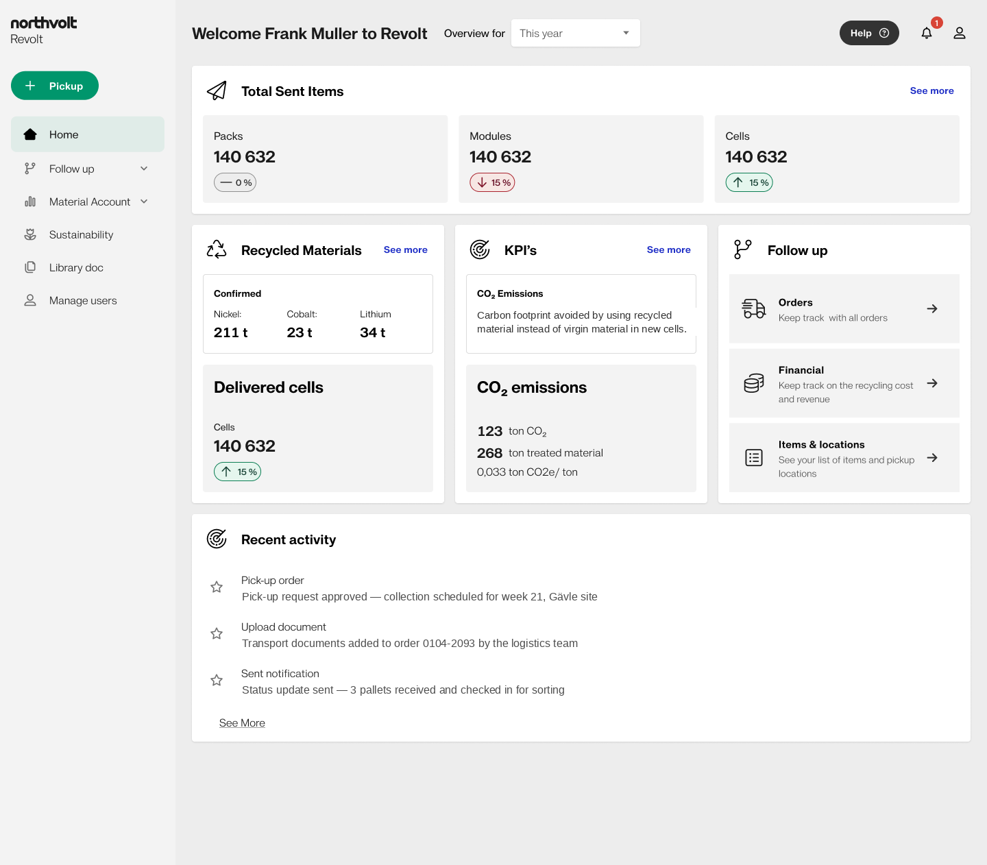
The interface stays calm, so the customer stays confident.
With the structure settled, the UI could do one thing at a time — clear status, requirements up front, and never asking the customer to understand the machinery behind it.
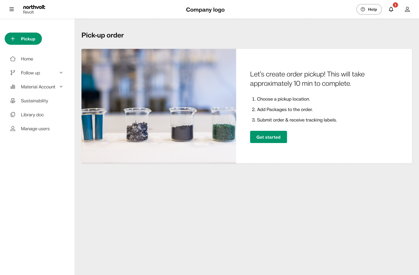
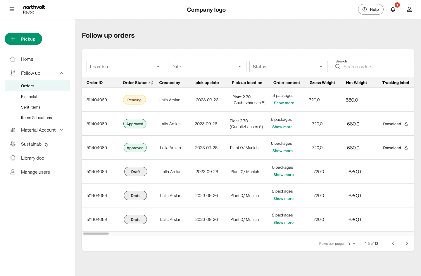
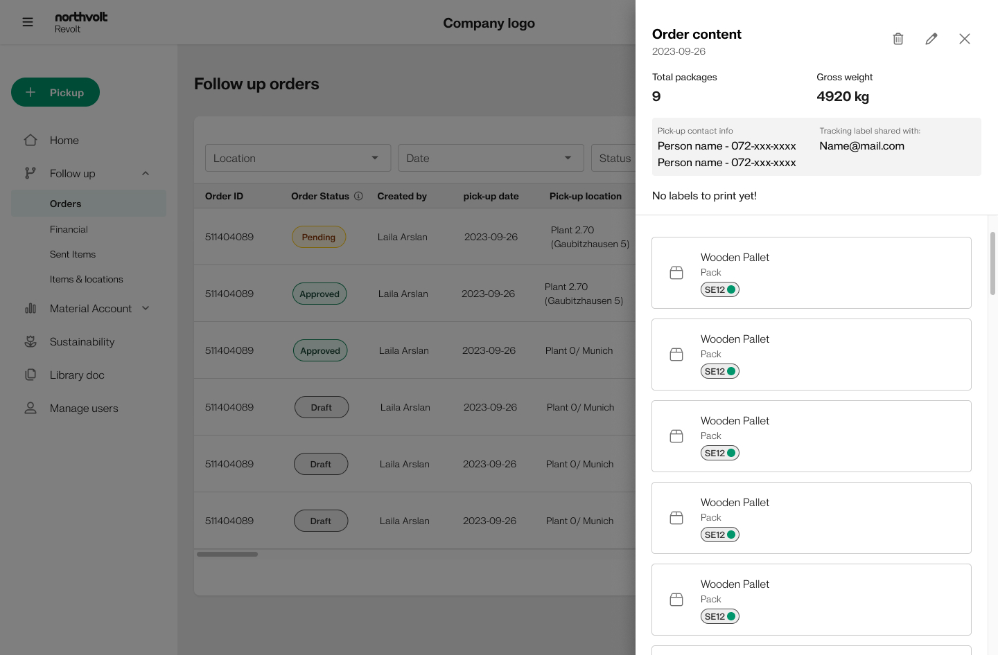
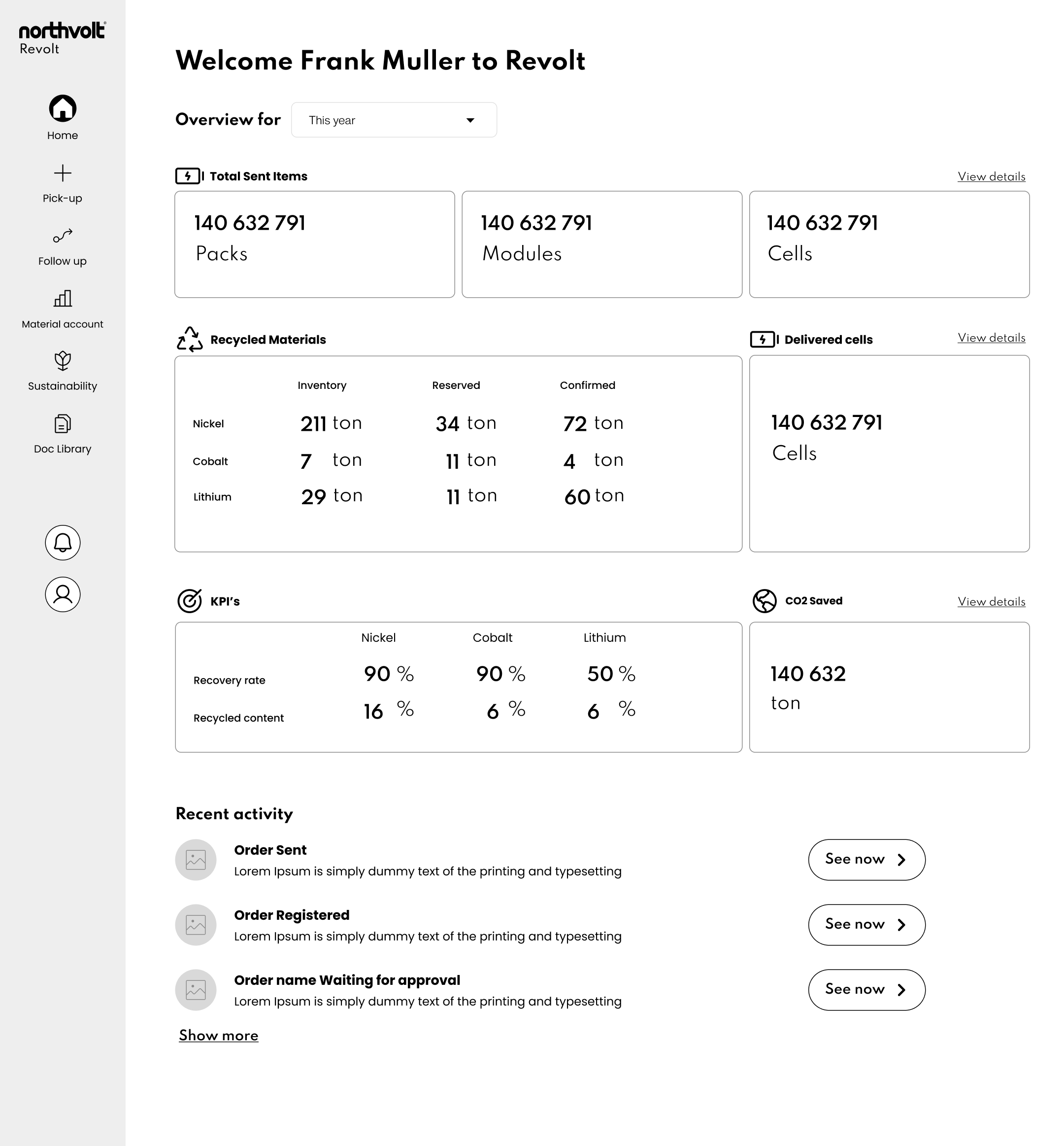
Testing didn't validate the design — it changed it.
I tested the prototype with representative users and translated each friction point into a concrete design change — from clearer navigation to upfront requirements and confirmation states.
Users couldn't tell where their request was in the process.
Added a persistent status stepper on every screen, so the current stage and what's next are always visible.
Compliance requirements appeared too late, causing rework.
Surfaced requirements up front as a checklist at request creation, with inline guidance instead of post-submission errors.
Internal, industrial terminology confused non-expert users.
Rewrote labels in plain customer language and added short, contextual definitions for unavoidable technical terms.
No confirmation after key actions left users unsure it worked.
Added clear confirmation states and next-step prompts after every submission, closing the trust gap from research.
Not everything could be built at once — so we put trust first.
I used MoSCoW prioritization to keep the first release focused on trust-building essentials: live status, upfront requirements, document handling, and request tracking. Nice-to-have ideas were intentionally moved out of scope.
- Request a recycling pick-up
- Live status tracking
- Up-front requirements checklist
- Document upload & storage
- In-portal messaging
- Compliance reporting export
- Multi-site account view
- Sustainability impact dashboard
- Saved request templates
- Role-based permissions
- Public marketplace features
- Automated pricing engine
- Native mobile app
Read left to right: trust-building essentials come first, ambition deferred with intent. The strike-through items were deliberately ruled out of scope, not forgotten.
I helped turn an undefined, multi-stakeholder service into a structured, tested product by mapping user needs, designing task flows, testing prototypes, and prioritizing a focused MVP.
The most valuable work happened before the UI: making the service understandable enough to design.
The portal moved into build, and the MVP was validated with real B2B recycling customers. Northvolt's bankruptcy stopped the release before launch — but the tested flows and service map had already proven the design against real users and real operations.
Structure is the design
In complex B2B services, the real work is sequencing and clarity — long before visual polish.
Trust is built in steps
Visibility, confirmation and plain language did more for confidence than any single feature.
Prioritize by evidence
Research and testing — not opinion — decided what earned a place in the first release.